Friday, 4 February 2011

Editing The Video

Screen Grabs - Editing the Video

EDITOR - AMANDA GANJEH
My partner Amanda used a variety of different editing techniques and styles to create our final product. Throughout the editing process I provided feedback to Amanda and we also made use of the number of students around the media department, most of whom fit into our primary audience, who we also asked to provide feedback along the way to ensure our product appealed to our target market.

This is copied from Amanda's blog to show the process she used to edit our final product.


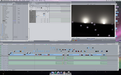
A screengrab from shooting the singer's solo scenes. Clearly you can see that the effects used are the compound blur, levels and brightness. This is done to enhance the quality of the image and to make the singer look more attractive as well as making the background more attractive. I believe this will appeal to the audience as a music video especially as it's visual so effects and attractiveness of singer and scenery is vital.
 
I have provided some before and after screen grabs of the editing I did on the video. It is rather common for people to shoot a scene or a video or even take pictures and think they look good in camera but once uploaded the picture or clip doesn't look good. It is important to either reshoot the scene or take the picture again, unfortunatley I could not reshoot the scenes due to busy schedules so I had to edit the scenes that didn't look good as best as I could more than all the other scenes.
First scene that didn't look good but was vital in the sequence was the intimate bedroom scene.

 BEFORE
 AFTER

As you can see before it was barely visible, everything was dark and the two actors could hardly be distinguished especially as it was filmed in a dark setting. What I decided to do was add a brightness effect (Brightness= 5 Mix= 42) so that the actors could become visible however this made the image come out very grainy and a terrible quality so I added a compound blur (Amount=4) This smoothed out the image a bit to give it a better quality as well as that 'dream' effect that all the narrative sequence maintains consistently throughout the video. Lastly I tinted the picture (Grey 44% and Amount 90) to give the effect of a dream or past reality that I had originally planned the whole narrative to contain. I did attempt to add other effects and brighten the picture further as best as I could unfortunately this was the best I could edit this shot due to the circumstances of the shot.

 BEFORE

AFTER

There was nothing wrong in this shot as the angle was correct and the quality was fine. I added a Grey tint 44% and a compound blur Amount 4 to keep the narrative efffect I mentioned earlier. I used this effect for a reason to create a dream like story for the narrative to not only seperate the narrative from the singer's solo scenes to avoid confusion but also create a more interesting visual for the narrative. The connotations of a tint on a narrative are that it does create either a surreal or alternate reality or even potrays the past. This was what I was trying to create a past tense narrative that that would also be an interesting thing to watch. This would keep the audience watching and listening thus marketing the product at the same time.


Here are some further edits made on the video for various different reasons.
BEFORE


AFTER


As you may see there wasnt much difference before and after the effects in these snapshots. That is because the effect was added just to create complete continuity with the whole sequence. This helped create a dark intimate setting with a hint of romance for a dark n romantic scene.
BEFORE


AFTER
There was an edit made on this scene because as mentioned earlier, the background and the whole shot seemed dull and therefore may have led to the audience not finding this scene attractive to watch. The following effects were added: Compound Blur= Amount  and Levels with a Gamma of 1. Unfortunatley with this effect and the sunlight on the actual day  affecting the shot, it created a shine on the singer's forehead. After a while trying various different effects I wasn't able to reduce the shine so I believe that this was the best effect for the shot as far as this shot could get.

Thursday, 27 January 2011

Production Schedule Day 2 - 3 & Shooting

Time & Date:    24/12/10  8pm-12am

Scenes:             Narrative Part 1
                         Getting ready scene, intimate scene

Locations:         3 Bampton Drive 
                         Mill Hill 
                         NW7 2AY
Equipment:        1 Canon Video Camera,1 battery charger, 1 Tripod.

Nana Arthur - Darker skintone challenges general representation of black women in music videos who are almost always of a lightskin complexion. 
Gyles Bart-Plange- Again used as darkskinned couples are rarely seen in music videos and this once again challenges conventions

On this shoot my partner amanda was filming and I was production manager. I did however overlook one thing, our camera started running out of battery and the charger we had been given didn't work. For this reason some of our filming towards the end had to be rushed however other than that the filming was successful and we came out with some excellent shots.

Time & Date:    25/01/11  9am - 11am

Scenes:             Narrative Part 2
                          Realisation Scene, Break-Up Scene

Locations:         3 Bampton Drive 
                         Mill Hill 
                         NW7 2AY
Equipment:        1 Canon Video Camera,1 battery charger and 1 Tripod.


Amanda: Director & Camera
Mia:  Production Manage& Choregrapher


RISK ASSESSMENT CARRIED OUT BY: Amanda Ganje                              PRODUCTION MANAGER: Amanda Ganjeh

ACTIVITY OR PROCESS:   BOOKING OUT KIT AND
 FILMING IN A HOUSE IN MILL HILL
SHOOT DATE:  24-25/12/2010 
DATE OF ASSESSMENT: 24/12/2010      LOCATION:  3 Bampton Drive Mill Hill NW7 2AY


A:  HAZARDS


B:  DEGREE OF RISK
(Refer to Risk Matrix)

C: PREVENTIVE MEASURES

D:  IF ACCIDENT OCCURS?

Nature of hazard


Person(s) at risk
(See below)

Severity

Likelihood

Risk
Rating

Measures in place aimed at
reducing risk to minimum level?

Further necessary measures, involving whom and by when?
Tripping over the cables/ equipment


Cas/Cre/FamMinorPossibleDMake sure all cables and equipment are together and out of sight.
Incase of trip immediate
assistance 
given.
As you can see there aren't many risks found in the location making it an excellent location to film and safe for our cast and crew.

Wednesday, 26 January 2011

Planning My Digipak & Press Advert

I am thinking about using close up image of the artists face as my cover. I feel that it has quite a similar feel to the Leona Lewis CD cover with the toussled hair and natural make up. I would use photoshop to edit the blemishes and possibly change the colour of the image to black and white. I feel that the eye contact and the parted lips would make this a strong cd cover attracting the attention of our primary audience (women aged 19 - 24) and our secondary audience (men aged 19 +). I'm planning on putting the artist name and song title in the top left hand corner on the artists hair. I feel that this will not take away from the striking image and i feel that a light colour text will stand out against the dark background of her hair.

I am thinking of using this image on the back cover of my digipak and postitioning it at the bottom right of the cover and having the tracks listed in the white area. The position of her legs in this photo is quite striking and sexy and I feel would work very well at attracting the male gaze. Sex sells.


I want to use this image on the inside cover of my digipak. I like the pose that the artist is in and feel that it is a good reflection of her image and style. I would position this image on the left hand side and on the right I would have a note from the artist to her fans thanking them for their support and encouraging them to work for their dreams and at the end of the note would be an enlarged copy of the artists autograph.


This is the image I want to use for the press advert. The background shows a typical London tower block which reinforces the British urban feel that we wanted to incorporate, but the low angle shot of the artist makes her look powerful and the eye contact grabs attention. I feel that the trench coat shows class while the pink dress underneath shows that she's young and girly. All in all I'm really happy with this image and think it will make a really attractive poster. On the poster I will place the artist name and song title across the middle of the image and below will have the words "Out Now" and logos of where it can be purchased from.

Monday, 24 January 2011

Research On Female RnB Artist Posters


This Rihanna poster uses striking black and white images of the artist combined with brightly coloured splashes and font. The result is very fun and exciteable with an 80's feel that I feel to be very eye catching. The main image is a close up of the artists face in black and white but her lips are bright pink which empahsises them. I feel that although this is in theme with the andy warhol 80's feel to the poster, is also an attempt to attract the male gaze by highlighting her mouth. The montage style is the aspect of this poster that i feel is most effective and I think that using a montage for Lizzie's poster could be just as effective, I do however feel that the bright splashes of colour and 80's style is irrelevant to Lizzie's style.

I think this Beyonce poster is very effective as the image of her is eye catching and her figure looks amazing and the use of props I feel works really well. Beyonce is seen here holding on to a directors chair with her name on it suggesting that she's the director or 'boss' of herself. The artists costume consists of a bright orange, figure hugging dress. By placing her foot on the chair and bending her leg, the artist emphasises the arch in her back and her bottom. This, combined with the clevage shown and the use of stilletos which are a phallic symbol, sexualise the image once again attracting the male gaze. I feel that soemthing like this could work for Lizzie as she also has a very nice figure which would be appealing to the male audience. Shot from a slightly low angle makes the artist appear superior and powerful.

I found this poster of female rnb singer Keyshia Cole to be very attractive and appealing. The use of a long shot of the back of her body attracts the male gaze and her stilletos are once again a phallic symbol srxualising the image. Her hands on her hips and facial expression make her seem very confident and sexy. Also i feel that the lack of writing or over the top designs make the image more striking and memorable.

For my poster of Lizzie I am going to try to incorporate the style of these female RnB artist posters. None of tehse artists are however, British and as it was one of my aims to keep Lizzie as 'British' in style as possible while also fitting her in to the female RnB genre, I am going to have to combine these ideas with some more underground, urban, British ideas. So far I am thinking along the lines of the use of graffiti style font, the use of typical London landmarks in the background or the use of union jacks on the poster. I will research this further.

Research On CD Covers

I have decided to research female RnB artist CD covers to try and ensure that Lizzie's cover reflects her genre and style effectively. As previously mentioned, my partener and I felt that Lizzie had a slight 'Leona Lewis' vibe.
This cover uses an extreme close up of the artists face, with the artist name and song title inserted above and below her face. The font is very simple, as is the artists make up. This implies that the artist is a raw talent, she's not heavily manufactured which appeals to many. The manufactured pop artists tend to be more heavily made up and the album colours use more eye catching images and fonts, but this is simple and effective with an 'it's about the music not the image' feel to it. I feel that this style could work very well for Lizzie's CD cover.


This Alicia Keys CD cover is also very simple but still very effective, although quite different from the Leona Lewis cover. The image of the artist is in black and white which, as a feature of our video, I feel that using a black and white image of the artist on the CD cover could be effective in creating a continuity throughout the package. The artist name is shown her in large lettering, again which i find very effective, however it still doesnt take away attention from the striking close up image of the artists face. The eye contact used on both this cover and on Leona Lewis' cover is very attention grabbing which is exactly what we need for Lizzie.

This Beyonce cover uses a mid shot of the artist. This shot is more sexualised than the shots seen on the previous covers. Beyonce's clevage, stomach and arms are here on show covered only by a glittered mesh top and she is pushing out her hip. This combined with the eye contact also used in the image attracts the male gaze. This could once again work for Lizzie as we need to attract a male audience. The background of the cover is plain and simple which makes the image of the artist stand out more. The artist name and title are once again quite simple so as not to draw attention away from the artist image.


I have included this N-Dubz cover as, like Lizzie, they were born and raised in London and this has been emphasised in their marketing. On this cover for example we see typical London style tower blocks behind the group. The use of images of London in the background enhances the selling point that the artists are British and staying true to that i.e not becoming "Americanised". I are also going to try to include this in our marketing of Lizzie, if not on the Cd cover then maybe on the poster instead.


I have also included this image of Ciara on the contents page of a magazine as I thought that using an image like this coule be very effective for the back cover of the CD and where the text is on the image could be the album track listings. The raised legs and stilletos are a phallic symbol and this sexualises the image and appeals to the male gaze.


Monday, 22 November 2010

First Day Of Filming - Artist Solo Scenes

Time & Date:    17/10/10  2pm onwards

Scenes:             Solo scenes of artist

Locations:          Barbican Serviced Offices
                          Central Point
                          45 Beech Street
                          London
                          EC2Y 8AD
Equipment:        2 Canon Video Cameras, Still Digital Camera, Reflectors, Gels, Camera Lights, Lighting Kit, Tapes

Director: Mia & Amanda    Camera: Mia & Amanda    Production Manager: Mia
All our equipment is shown here during set up.
Sets:

Set 1: This is the bench used in the solo sequence, Lizzie sits on this bench with her legs outstretched. We thought this was effective as it made her legs look incredibly long and enhanced her sexuality with the high heels still in the shot whilst still being able to see her face clearly as a long shot was not needed to fit her whole body into the frame whilst in this position.


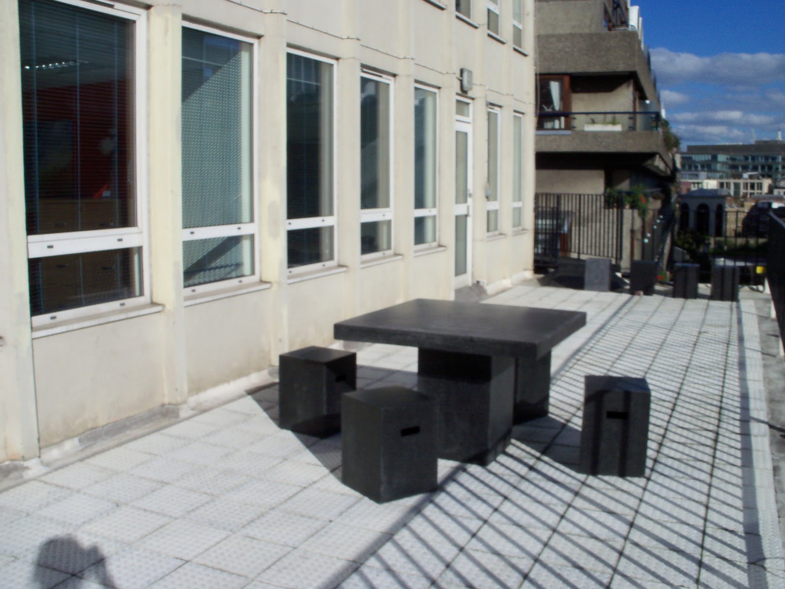
Set 2: This is the roof terrace, we filmed more footage of Lizzie miming to her song whilst she held on to these railings. We found the background of all the Barbican flats, typically recognisable as London, to be very effective at showing where Lizzie is from so much so that we changed our original idea of having Lizzie wear a union jack t-shirt as part of her costume to show her "Britishness" as we felt that the background of these shots had already taken care of that aspect of marketing. Whilst shooting on the roof we had to deal with a problem that we hadn't accounted for: the sun. We ended up having to wait about 20 minutes for the sun to go behind a building as the reflector was doing absolutely nothing to the glare and shadow the sun was creating however after the wait the shits came out extremely well.

Set 3: This glass brick wall was the set where we filmed more footage of Lizzie miming in her blue dress costume. We chose this as through the glass the blue carpet can be seen and when the light hits the glas the blue reflections complimented the blue dress very well. We also chose the blue as it connotes sadness which is obviously very significant for this particular song. The extension cord we used to plug in the laptop and play the track for Lizzie to mime to was not long enough so we had to find another. We also had very little space whilst filming and ended up having to lean over the banisters so that we could create the shots we wanted to. The lighting also caused issues here as there was too much shadow however we managed to use the reflector to bounce most of the shadow away.

Set 4: This image shows Lizzie taking a quick break from a hard days filming sitting against a curved white wall. We chose this particular background as the curved wall bounced the lighting very effectively and this and the gels we used combined made the images taken from these shots very flattering. The black costume against the white background is very striking and also very common for RnB videos. As you can see by this point Lizzie was very tired but the shots still came out surprisingly well.


The shoot went extremely well and we were really happy with all the shots.


This is an example of a page from our Edit Decision List and Me using it to help with log and capture. The EDL helped us to differentiate between usable and unusable shots quickly and easily.

Look Document 17/10/10

Look Document

Costume

1-     Pink dress, brown trench coat, black heels.
2-     Pink dress black heels, black cardigan
3-     Blue dress
4-     Black vest top, leggings, black heels
Costumes are all figure enhancing or contrasting with the background to draw more attention to the singer.
Set

1-     Terrace, posh towers in background
2-     Terrace, posh towers in background
3-     Tiled glass background
4-     White studio background
Varied the background to challenge conventions and keep the audience entertained as the same scenes in the montage will look boring. The view of London in the Background reinforces the "Britishness" of the artist which is something we wanted to get across.
Props

1-     Railings
2-     Stone Table
3-     No props
4-     No Props
Props kept to a minimum as main focus is on the singer, props only used to enhance the singers sexuality like the table.
Lighting

1-     Natural Lighting
2-     Natural Lighting
3-     Backlight, two key lights
4-     Key lights, Top lighting, Spotlights
Lighting and Gels used to make the singer seem glamorous and flawless. Naturally the attention will be drawn to were there is more light.
Colour Scheme

1-     Pink& Black& Grey
2-     Black & Pink
3-     Different Shades of blue
4-     Black & White
Black used to show the end of the relationship in the narrative, mourning period. Pink used for feminine reinforcements. Blue for sadness and serenity also the reinforcements of the term “I’m feeling blue”.
Camera Style

Mixture of Low angles High angles close ups and Long shots. Make the audience see the singer from different viewpoints.
Editing Style

Create a montage, add a bit of glow to some scenes to make the video look more professional and the singer look better and more celebrity like.
Special FX

None.
Performance

The dancer will be moving in a seemingly unchoreographed manner.
Kinetics

Dancer will move around a lot during the performance purely for visual pleasure so audience doesn’t get bored  watching the video.